
Artwork Explained
If you are new to the printing world you may be confused when you hear bleed, tick marks, CMYK, sending a document at the correct size or even PDF format, so I have created this page to help explain what all of this means so you can become a pro in print and impress your local printers with your knowledge!
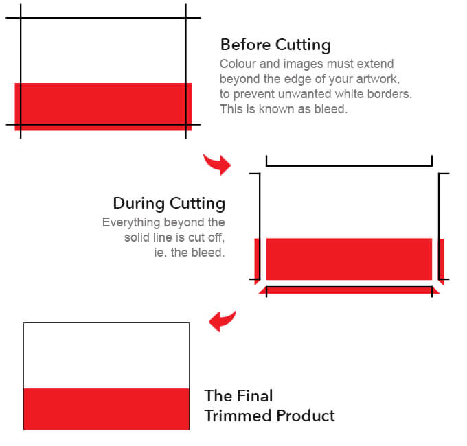
Bleed Explained
Bleed is an additional area added (normally 3mm on all edges) to the finished size of your document. For example A4 (210 x 297mm) with bleed would be 216 x 303mm.
We need bleed added to artwork as it gives us more room for maneuver. If you have ever seen a finished print with a fine white line on the edge, this usually means that bleed was not added so when the job was cut down, it left a white strip along the edge. This doesn’t mean the guillotine was not accurate, but when several sheets are being cut at one time, they may shift by only a fraction of a millimetre and the white edge will appear.
Every image or background colour which reaches the final cut size of your document, needs to bleed over the edge to prevent any white lines.
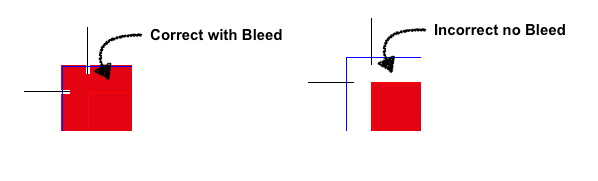
How do I apply bleed?
You will need to make the document 6mm (3mm for each edge) bigger at the start of creating your artwork and make sure every colour and image reaches the edge.
If you are using Canva, select the finished size you want i.e. A4 (210 x 297mm) and create your design as normal making sure you go past the border (this will become the bleed and will be trimmed off.) When you get to downloading your file select File – PDF Print – and tick the boxes crop marks and bleed.
Quality / Resolution of your files
Resolution is one of the most common issues in printing. If low it can make the final product look blurred or pixelated.
Sometimes files can look okay on screens but will appear fuzzy as soon as it is printed, this is because screens will only view documents at 72dpi (dots per inch) whereas commercial printers print at 300dpi. Vector files are made up from equations – this means it will never distort, regardless of how big you make it. This is why we prefer vector files when using a logo for example.
To check the resolution of your file you could zoom in 100%, this will show you what your finish product will look like once printed. Sending files in the correct size is another way to keep the quality of your image, as a file sized A6 being blown to A3 will usually stretch the image beyond it’s capacity.

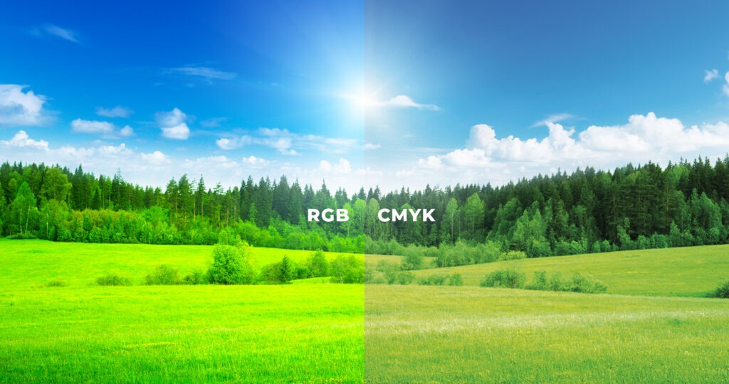
CMYK
CMYK- Cyan, Magenta, Yellow and Key (black). CMYK is subtractive, meaning inks are applied to a white surface to absorb light and create colours. When any of these four colours are combined, together they subtract various parts of the light spectrum which creates certain colours, for example: Cyan absorbs red light, so blue and green is reflected so when cyan is added to the page shades of green and blue are created. Each of these four colours absorbs and subtracts different colours thus reflects different colours.
Printers use tiny dots of cyan, magenta, yellow, and black inks, carefully overlapping and mixing them to achieve the desired colours. Larger, closely spaced dots create darker areas, while smaller, more spaced-out dots result in lighter shades.
RGB- Red, Green and Blue. RGB is an additive model which uses light to create millions of colours on digital screens by mixing varying intensities of these three primary colours. More light makes brighter colours, with full intensity creating white, and no light creating black.
RGB offers over 16 million shades while CMYK delivers around 16,000. That’s why bright, saturated RGB tones can look flatter once printed. Even when you’re viewing a CMYK proof as a PDF file, your monitor is still RGB-based so won’t always give a perfect preview.